

Data visualization is the graphical representation of information and data via visual elements like charts, graphs, and maps. It allows decision-makers to understand and communicate complex ideas to facilitate faster responses to market changes or operational issues. This is especially useful for businesses that rely on collecting and managing massive amounts of data for analysis.
That said, to take advantage of these benefits, businesses need to invest in proper tools and training, which may pose a challenge to smaller companies and limited budgets.
SEE: Data Governance Frameworks: Definition, Importance, and Examples (TechRepublic)
How does data visualization work?
Data visualization involves converting data into a graphical representation. This process is often easier and more effective than analyzing spreadsheets or reports. Tools and software process large datasets and present them in a visual format that highlights patterns, correlations, and trends that might not be apparent from raw data.
The difference between data visualization and traditional reporting comes down to how the former offers dynamic graphical representations that allow for more in-depth exploration of the data. Reporting typically involves static tables and figures, while data visualization provides interactive, engaging formats.
SEE: What Is Data Quality? (TechRepublic)
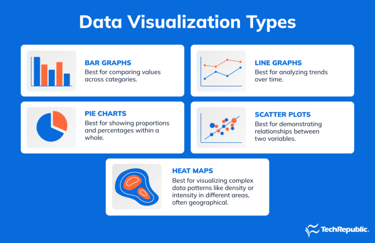
Types of data visualization
Common types include:
- Bar charts: For comparing values across categories.
- Line graphs: Best for analyzing trends over time.
- Pie charts: Best for showing proportions and percentages within a whole.
- Scatter plots: Best for demonstrating relationships between two variables.
- Heat maps: Best for visualizing complex data patterns like density or intensity in different areas.
SEE: Data Governance Checklist (TechRepublic Premium)
Benefits of data visualization
- It transforms large and complex datasets into more digestible visual formats.
- It offers data in a more intuitive and comprehensible manner, making it easier to spot trends, outliers, and patterns.
- Users can quickly grasp key insights from the data.
- Effective in revealing trends and patterns hidden in raw data, essential for predictive analytics and planning.
- Visual presentations are engaging and easier to understand, making them powerful tools for communication.
SEE: How to Measure Data Quality (TechRepublic)
Challenges of data visualization
- Correctly interpreting it requires a certain level of skill and understanding.
- Poorly designed visualizations can distort the data or fail to highlight the most important aspects.
- The effectiveness is contingent on the quality and accuracy of the data being visualized.
- Potential for information overload. If not managed properly, it is difficult to discern the most relevant insights.
- May need significant investment in tools and training.
SEE: Best Practices to Improve Data Quality (TechRepublic)
Data visualization use cases
Some notable examples include:
Healthcare data analysis
It can be used to track diseases, manage hospital resources, and analyze patient data for trends and patterns. For instance, during a pandemic, visualization tools could monitor the spread of a virus and resource allocation.
Financial market analysis
Financial institutions use it to track market trends, analyze stock performance, and make investment decisions. Complex financial data is transformed into understandable charts and graphs, thus aiding risk assessment and portfolio management.
Sports performance analysis
Sports teams and coaches use it to assess player performance, plan strategies, and improve their training methods.
Retail and sales analysis
It can be used to track sales trends, customer behavior, and inventory management. It helps retailers identify popular products and optimize supply chain processes.
Environmental monitoring
It can be used to track climate changes, monitor pollution levels, and study wildlife patterns.
Cybersecurity threat analysis
The tools are used to detect patterns in network traffic, identify potential threats, and monitor system vulnerabilities.
SEE: Data Governance in Entertainment (TechRepublic)
Data visualization tools
Some top tools include:
- Tableau: Superb choice all around that offers standout real-time visualizations and is ideal for complex data visualizations.
- Microsoft Power BI: Popular choice for businesses due to its deep integration with other Microsoft products.
- Looker Studio: Cloud-based BI and data analysis service with a strong data visualization component that is great for use with other Google products.
- Zoho Analytics: User-friendly tool with a wide range of visualization and collaboration options.
- QlikView: Uses advanced AI and machine learning, with its strongest feature being its associative data modeling capabilities.
This article was originally published in January 2024. It was updated by Antony Peyton in June 2025.